The last few years have seen a burgeoning of the movement of ‘poptimism.’ Poptimism takes popular music as an artistic form worthy of merit and critique like any other, and has been very productive. Popular music is analyzed and appreciated more rigorously and superstars like Beyonce, Nicki Minaj, and Taylor Swift get due credit; however, within poptimism, there is a trap: Instead of taking pop music as something to critique, writers become boosters for pop artists, with everyone falling over themselves to be the one to pay homage to the new Slay Queen. With this in mind, one can examine Adele’s “Hello.”
“Hello” had considerable buzz around its release. It is the first music video to be shot in IMAX film, which people generally associate with a sense of grandeur and respectability. This is a common theme in popular culture; Macklemore and Ryan Lewis are known for using RED digital cameras, a technical aspect which contributed to their extremely successful videos. Going back a bit further, James Cameron’s Avatar’s enormous cost of filming helped contribute to its hype. The problem is, in the intrigue caused by flashy technology and high budgets, aesthetics often get pushed to the side. Avatar is a great example of this: It made an incredible amount of money, but received little critical acclaim beyond its impressive visuals. “Hello” feels the same.
“Hello” is a torch song that speaks to a lost lover of Adele’s, a topic she is well known for exploring. The song itself is decent, revealing a vulnerable side of Adele which compliments the fiery defiance she showed on 21. But there’s nothing new or exciting here—the material is more or less the expected from Adele, and it treads over ground that has been trampled by hundreds of other songwriters. That said, the thing that brought this song to fame is the video.
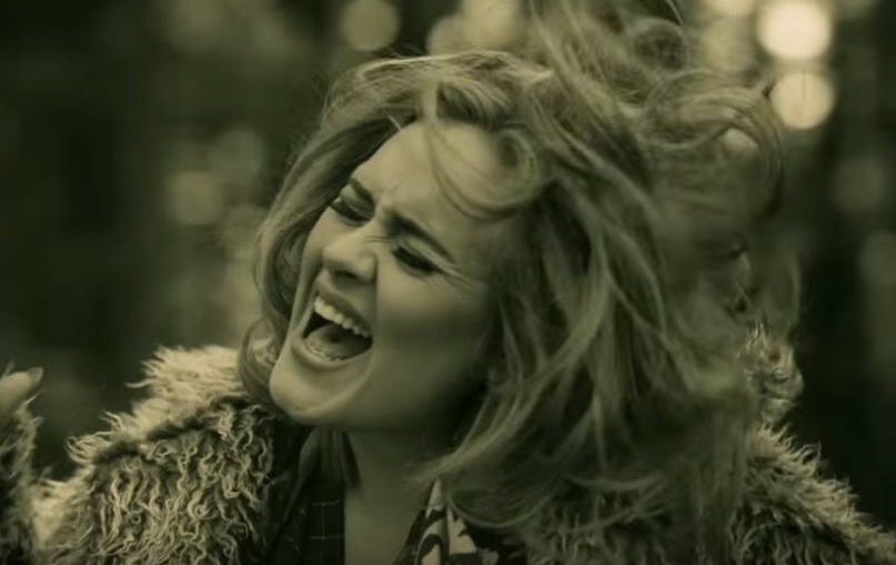
The video is… boring. It looks nice, shot in crisp sepia tones. It’s decision to hire a person of colour to play the role of Adele’s lost lover is commendable and different from traditional representation, if not groundbreaking. Beyond that, it drags on, and the introduction is slow and trite. The music video begins and ends with a direct address: Adele’s eyes looking at the audience. Her eyes are certainly striking, but it’s not enough. The video doesn’t take advantage of the potential for music videos to be non-narrative and instead follows a boring linear structure, occasionally cutting back to clichéd flashbacks.
Ah, remember when we laughed? Remember when later we cried in the rain? Good times.
But those flashbacks aren’t cut in a particularly impactful narrative style—they’re just kind of sprinkled occasionally, and the obvious opportunity to have the first flashback start at the chorus is missed. Adele picks up a phone and talks in a way that is frustratingly and distractingly mixed. In the second verse, the video finally gets away from the basic structure to show us a classic phone booth with the receiver hanging off of the hook. Another form of connection that is old and not working. The image is getting a bit played out, and the box just kind of sits there, and Adele doesn’t interact with it in any meaningful way. Then there’s a bridge, and another direct address and viewers get the big shot, the IMAX shot of her at a pond with blossoms flying—the climactic moment. It all feels like it is trying very hard to be meaningful, and has all these signifiers of meaning, but ultimately it doesn’t reach anything significant. It is ultimately an attempt to mimic the aesthetic of an independent video.


