Burnside is the vision of practicality – Alexander MacKenzie
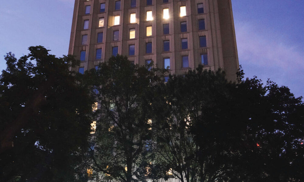
A quick glance towards Burnside Hall reveals nothing striking about its immediate design. Perhaps the most observant of oceanographers or astrophysicists studying in the building could casually point out its warm sandy colour, and wavy texture adorning the walls outside. Likely only the oceanographer, not without some degree of self-contempt, would remark that the building is shaped like sand waves on a beach. But since most students entering the building are not architects, features of this sort would go, for the most part, unnoticed. Despite having nothing extraordinary or jarring architecturally, there remain many appreciable things about the building worth students’ attention.
By far, the most enticing feature is that Burnside is located right on top of an extensive underground tunnel system, providing passages to the rest of the buildings in the science and engineering complex. The basement makes for a fantastic refuge and student space, offering a sizable yet cozy study area full of computers, which add a sentimental cybertech ambience. When the lower-level Soupe Café is open, Burnside’s basement is filled with the smell of freshly-baked pastries. Most of McGill’s sandwich enthusiasts already know about the coveted Burnside basement grilled cheese.
When entering the building from underground tunnels, students might notice the appreciable lack of crowding around and within the three spacious red elevators. The upper levels generally consist of narrow, colour-themed hallways, with space for hundreds of small rooms, many of which are typically unoccupied. Also, there are great study spaces on the fifth and 11th floors, the latter featuring cozy soundproof rooms and eight-foot-tall windows overlooking both McGill campus and Mount Royal.
Burnside Hall also possesses other purposes on McGill campus. The building was designed to allow for five additional stories if McGill were to ever need more space on campus. The top of the building houses meteorological equipment for use by students of the Department of Atmospheric & Oceanic Sciences to observe the night sky over Montreal.
As far as the average McGill student is concerned, Burnside Hall is a convenient, practical, and pleasant space. It is an invaluable centre for student life on campus and allows astrophysicists and oceanographers, along with the occasional Mathematics or Statistics student, to study, grow, and prosper at McGill.
Burnside can burn – Sarah Kayed
When it comes to Burnside Hall, McGill’s attempt at Brutalism “fakes it, but never quite makes it”. Most students consider this science faculty building to be ugly, if not depressing. From an architectural perspective, Burnside attempts to imitate the style of Brutalism and fails quite miserably, instead existing as a bleak space unfit for educational needs.
Brutalism is often characterized by an exposed concrete exterior of little ornamentation, constructed so that the interior serves as a space for social gathering. Additionally, this design approach was connected to ideas of social reform and collectivity within architecture, through a desire for equality. When looking at Burnside, one cannot help but wonder—what ever happened to political architecture?
Typically, this architecture style adopts inward-facing repetitive windows paired with hidden entrances. At Burnside, however, the façade is primarily glass, taking the spotlight away from the raw concrete exterior. The windows—spanning floor-to-ceiling across all floors—overshadow the concrete’s texture and grain, moving it away from the Brutalist concrete style.
It seems that the only actual Brutalist features of this site are the hidden entrances and the underground tunnels for ease of accessibility. The inside of the building, on the other hand, resembles a labyrinth seemingly impossible to navigate. For a structure to embody equality, accessibility becomes a key element, and, in Burnside, navigational difficulty is the most pressing design issue. No McGillian wants to be lost in a concrete dungeon looking for a lecture hall or computer lab.
A better example of the Brutalist style on campus is McLennan Library. The prefabricated concrete library incorporates a spacious interior with easy access from floor to floor; almost every aspect of the space is visible and students can complete their work in a suitable environment. Comparatively, Burnside is a naive, even hypocritical, imitation of Brutalism that creates an oppressive space for students and faculty.


