Though the reopening of the Schulich Library was timed conveniently with the impending closure of the McLennan-Redpath Complex, whether the new and improved Schulich will make a worthy competitor is the question of the hour. Apart from the labyrinthine path one must take to locate the library, Schulich’s questionable capacity, amenities, and interior design will determine the library’s reputation in upcoming months. Yet, as it stands, Schulich’s opening is not a solution for the study space to be lost in the impending McLennan-Redpath closure and must be accompanied by an increased investment in accessible infrastructure across campus.
The intrigue surrounding the newly renovated Schulich is offset by the fact that it remains inaccessible for newcomers—no one seems to know where it is. Unable to find the mysterious building with instructions from Google Maps, assistance from the McGill community was needed in my own search. Alas, this only served to complicate the issue. What was meant to be a quick five-minute walk from Leacock more closely resembled the hunt for //El Dorado//.
While it was determined that the simplest path to Schulich was through the Adams building and then to simply turn left at the Frank Dawson exit, it did actually require multiple sources to find this library. This is a major note in the con column when comparing Schulich’s accessibility to McLennan’s.
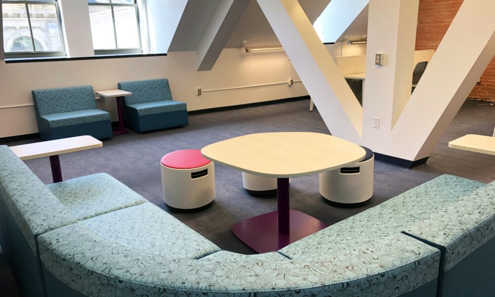
Schulich’s interior design is decidedly its most impressive feature. With an old-style structure, the subtle aroma of rich wood permeates the air of the building, lit with rays of natural light. For students wishing to study surrounded by an aura of mystery, a lovely little nook perfect for private study lies just up the stairs, though finding it unoccupied may prove to be a challenge. A soothing blend of blues and oranges throughout the space combined with classic brick walls provide a warm ambiance conducive to studying. Even whilst maintaining its architectural roots of eras past, Schulich is not lacking a modern touch. There are several more contemporary work desks and study pods for those with more metropolitan tastes, as well as comfy couches perfect for studying with friends—not to mention the futuristic sixth floor, with its beams and windows that evoke the feeling of studying inside a spacecraft. A potential cause for concern is the basement, which is comparable to studying in a dungeon. But, there may too lie a market for dark and melancholy study spaces.
However, looks aren’t everything. One consistent complaint from McLennan-goers remains that the library is always full. If students already believe the largest library on campus has a capacity issue, Schulich faces an unavoidable fate of overcrowding once midterm season hits. As the influx of library goers inevitably increases later in the semester, having to wait indefinitely for Schulich’s one and only elevator may prove particularly frustrating for those who need it. While those able to access the library will be able to make use of valuable resources such as printers, computer workstations, quiet zones and more, those unable to take the stairs may be prevented from accessing such amenities with ease. In creating these new spaces for students, McGill needs to place more emphasis on ensuring that students’ accessibility needs are met rather than focusing on aesthetics.
In a push to modernize and create more space for students in the McLennan-Redpath Complex, McGill has undertaken its //Fiat Lux// project, the reason for the Library’s upcoming renovations. While McGill’s ambition is admirable, attempting to solve a space issue by creating more of a space issue, albeit temporarily, does little to solve the problem.
All things considered, Schulich’s appealing aesthetic quality and promising amenities mask both a lack of space and of accessibility. Will Schulich emerge victorious against the test of anxiety-induced vomiting, spilt coffee, and stress-tears? Or, will it be doomed to the fate of McLennan—relegated to reconstruction once McGill decides it is no longer nice to look at.


